
A Founder's Guide to Designing for the Web (Without the Chaos)
- Dec 19, 2025
- 14 min read
That feeling when you know your website needs work, but the thought of starting is completely overwhelming? You’re not crazy. You’re drowning in conflicting advice about SEO, trends, and a dozen different tools, and it’s impossible to see a clear path forward.
It makes total sense that you feel stuck.
Why Designing for the Web Feels So Heavy
Starting a website project often feels like you’re being asked to build a house without a blueprint. You know how critical it is, but every article and “expert” offers a different opinion on where to begin.
This isn’t a sign you’re failing; it’s a sign you’re dealing with too much noise and not enough structure.
Most teams get stuck here because they’ve never had someone step in to structure the work. They try to tackle visuals, copy, user flow, and technology all at once, without a logical sequence. That approach creates confusion and makes the whole process feel much heavier than it needs to be.
The problem isn’t web design. It’s the lack of a simple, foundational approach to guide your decisions.
What’s Really Causing the Chaos?
That feeling of being swamped usually comes from focusing on the wrong things at the wrong time. You’re debating a colour palette when you’re still not clear on what you want a visitor to do on the page. It’s like trying to choose curtains before the walls are up.
A few things often amplify the confusion:
Endless Trends: The internet is flooded with articles on the “latest” design trends, making you feel like you’re constantly behind.
Vague Goals: Without a clear definition of success, every design choice feels random and subjective.
Technical Jargon: Words like UX, UI, and CRO are thrown around without much context, adding another layer of confusion.
The secret to great web design isn’t knowing everything. It's knowing what to focus on first. Getting absolute clarity on your primary goal is the anchor that simplifies every other decision.
The Path to Clarity
Instead of adding to the noise with another list of tips, we’re going to give you something more useful: a way to think. The goal isn’t to turn you into a designer. It’s to provide you with the structure and confidence to lead the project, whether you’re working with a freelancer, an agency, or your in-house team.
This guide will break the process down into logical, manageable pillars. We’ll help you move from a state of overwhelm to one of clear, calm direction. It all starts with grounding your project in what actually matters for your business.
The Four Pillars of Effective Web Design
If web design feels like a tangled mess of conflicting advice, let’s simplify. You don’t need to chase every new trend. Instead, you can bring immediate clarity to your project by focusing on four foundational pillars.
These aren’t glamorous tricks; they’re the non-negotiables that decide whether a website actually works for your business. When we embed with a team, these are the first things we lock down. Get them right, and you have a stable, practical foundation to build on.
Without a solid framework, projects descend into chaos. Overwhelm sets in, which opens the door to subjective opinions and needless complexity, pulling the entire project off track.
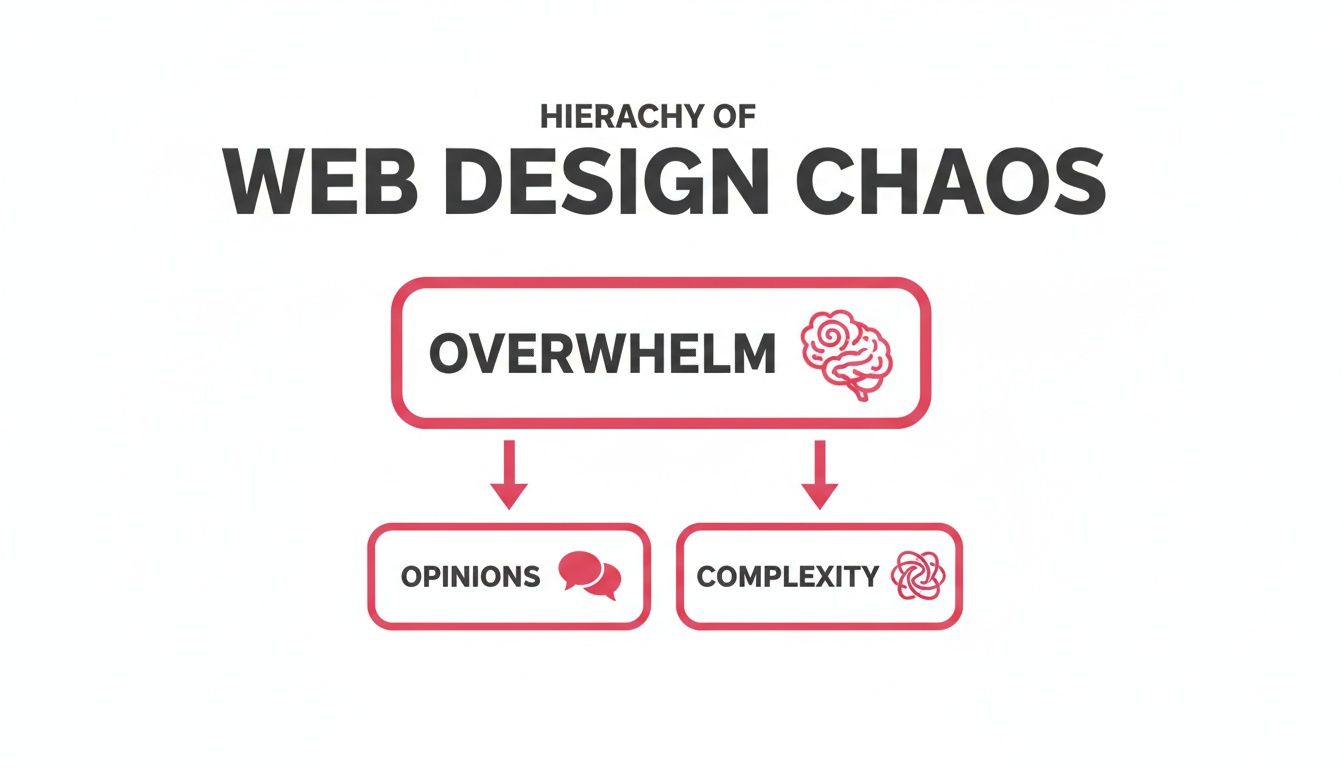
This is what happens when founders prioritise personal tastes over strategic decisions. These four pillars give you the structure to stay focused on what matters.
Let’s break them down. Think of them as the bedrock of any successful website - get these right, and everything else falls into place.
The Four Pillars Explained
Pillar | What It Means | Why It Matters for Your Business |
|---|---|---|
User Experience (UX) | Making your website easy, logical, and intuitive to use. It’s the invisible structure that guides visitors without confusion. | Good UX keeps people on your site and guides them towards becoming a lead. Bad UX makes them leave and never come back. |
Responsive Design | Ensuring your site looks and works perfectly on any device, from desktop monitors to smartphones. It adapts the layout to fit the screen. | Over 63% of web traffic in Australia comes from mobile. A non-responsive site actively turns away most of your potential customers. |
Performance | How fast your website loads and responds. It’s all about speed and efficiency. | A slow site kills trust. Even a one-second delay can cause visitors to give up. Speed signals professionalism and respect for the user’s time. |
Accessibility (A11y) | Design your website so everyone, including people with disabilities, can use it. This involves features such as screen reader compatibility. | An accessible site is more transparent and easier to use for all visitors, improving the overall experience and expanding your audience. |
Getting a handle on these four areas is the first step towards building a website that doesn’t just look good, but actively helps your business.
Pillar 1: User Experience (UX)
At its heart, User Experience (UX) is about making your site easy to navigate. It’s the invisible architecture that helps a visitor find what they need without hitting dead ends or feeling confused. Good UX isn’t about flashy animations; it’s about clarity.
Think of it like a well-organised supermarket. You know where to find the milk because the layout makes sense. A website with poor UX is like a supermarket that hides the bread in the cleaning aisle - it’s frustrating, and people will leave. This is also closely connected to your brand, which we explore in our guide on why small businesses need brand identity.
Pillar 2: Responsive Design
Responsive design ensures your website works seamlessly on any device. It’s not just about shrinking things down for a phone; it’s about adapting the experience to the user’s context, whether they’re on a desktop, tablet, or mobile device.
Here in Australia, this is non-negotiable. Mobile devices account for over 63% of all web traffic. If you neglect the mobile experience, you’re slamming the door on more than half of your potential customers. A “mobile-first” approach isn’t a buzzword; it reflects how people actually use the web.
Pillar 3: Performance
Performance means one thing: speed. How quickly does your site load? How fast does it react when someone clicks a button? In a world of short attention spans, even a one-second delay is enough to make someone give up.
Slow-loading pages are usually the fault of massive images, messy code, or a poor hosting setup. Fixing these isn’t just a job for developers; it’s a critical part of the user experience. A fast website feels professional. A slow one erodes trust before a visitor has even read a single word.
A fast, reliable website is a silent brand ambassador. It shows respect for your visitor's time and sets a standard of quality for your entire business.
Pillar 4: Accessibility (A11y)
Accessibility, often shortened to A11y (“a,” then 11 letters, then “y”), is the practice of building your website to be usable by everyone, including people with disabilities. This means designing for screen readers, ensuring colours have enough contrast, and allowing people to navigate with a keyboard.
But this isn’t just a box-ticking exercise. Here’s the secret: designing for accessibility makes your site better for everybody. Clear headings, descriptive links, and logical page structures improve usability across the board. It forces you to build a website that is fundamentally clear and easy to understand - principles that benefit every single person who visits.
From Pretty Pictures to a Real Business Tool
I’ve heard this story too many times. A company sinks a small fortune into a new website. It looks impressive, it’s modern… and then, nothing. The phone doesn’t ring. The lead form sits empty. The business hasn’t moved an inch.
This is what happens when we treat a website like a digital brochure instead of a strategic tool. A beautiful site that doesn’t bring in customers is just an expensive piece of art. It’s a classic sign of a project that was all about aesthetics, with no clear purpose driving the design.
So many founders get trapped here. They get caught up in the look and feel but overlook the engine that turns a casual visitor into a genuine customer.
Shifting from “How it Looks” to “What it Does”
The real shift happens when you go from “how should this look?” to “what does this need to do?” Every single element on your site - every headline, button, and image - should work towards a specific business goal. Without that strategic anchor, your design decisions are just guesswork.
Think about the last time you landed on a tech website and still had no clue what the company actually did after ten seconds. You probably left. That wasn’t a failure of visual design; it was a total failure of strategy.
The site didn’t guide you. It didn’t answer your most basic questions. It simply didn’t have a clear job to do. This is a common pitfall, and you can avoid it by defining your primary goal before you even think about colours.
A website's job isn't just to look professional. Its main job is to guide a specific person towards a specific action that benefits them and your business. Everything else is secondary.
What is Your Website’s One Key Job?
Don’t try to make your website do ten things at once. Pick one. What is the most critical action you want someone to take?
For most B2B businesses, it usually comes down to one of these:
Book a Demo: Getting qualified visitors to schedule a call.
Start a Trial: Nudging users to sign up and experience the product.
Generate a Lead: Convincing people to download a resource or fill out a contact form.
Choosing one gives you immediate clarity. It simplifies every decision that follows because you now have a filter: “Does this help or hinder our goal of getting more demo bookings?” This one question brings focus to a chaotic process.
Mapping the Path Forward
Once you know your goal, the next step is to map out the most straightforward path for a user to reach it. This is the user journey. It’s not a complex framework; it’s just the logical sequence of steps someone takes on your site.
Simple Scenario: If your goal is to book a demo, a simple journey might look like this:1. Homepage: The visitor immediately understands what problem you solve.2. Case Study Page: They see proof that you’ve solved it for businesses like theirs.3. Pricing Page: They get a clear picture of the investment.4. Book a Demo Form: They take the final, confident step.
This clarity around the user flow is essential. I find that for many companies, a confusing website structure is the main reason their professional services website isn’t winning them clients. Thinking through this journey is the first real step to fixing it.
This strategic thinking is vital in the competitive Australian market. With local e-commerce set to hit $46.3 billion AUD by 2025, customer expectations are higher than ever. To keep up, designs must use strong visuals, feature customer reviews to build trust, and ensure robust security.
Creating Structure with a Simple Design System
Ever been on a website where the buttons on one page look completely different from the next? Or the heading font mysteriously changes halfway through an article? It just feels a bit… messy. That small sense of chaos quietly erodes a user’s trust.
This inconsistency is the silent killer of good web design. It’s what happens when there’s no single source of truth for your visual elements. Developers are left guessing, and designers end up creating endless one-off variations. The solution isn’t more design files; it’s a system.
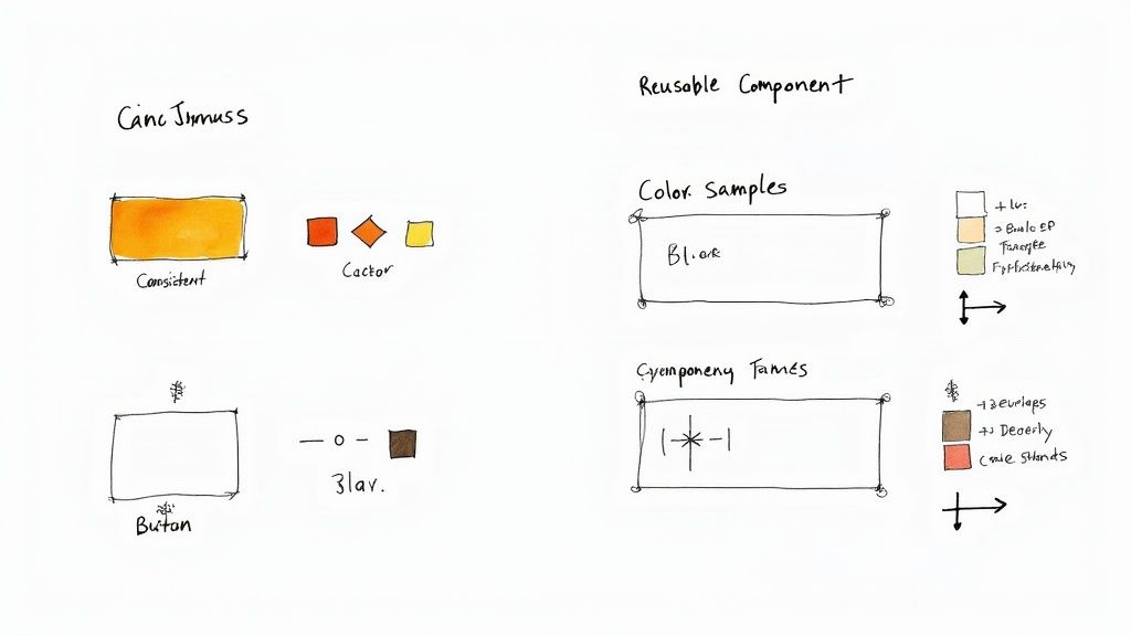
A simple design system brings much-needed clarity and structure. Think of it as a centralised library of reusable components - your specific colours, fonts, and buttons - that everyone on your team can draw from. It ensures every part of your website looks and feels like it belongs to the same unified brand.
What Goes into a Simple System
You don’t need a complex system to see the benefits. For most businesses, a simple one-page guide covering the basics is enough to create consistency and speed up development. This is where a sprint approach quickly creates clarity, as we can define these core components and start building on a solid foundation.
Your basic system should include:
Colours: Your primary, secondary, and accent colours. Don’t forget shades for text, backgrounds, and alerts (like success or error messages).
Typography: Your fonts for headings (H1, H2, H3) and body text. Include their size, weight, and line height.
Buttons: The look of your primary, secondary, and tertiary buttons across all their states (default, hover, disabled).
Forms: The appearance of input fields, labels, dropdowns, and checkboxes.
Creating this simple guide removes the guesswork. It provides a clear, shared language for you, your designer, and your developer, which is crucial for building with confidence.
A Clear Handoff to Your Developer
Once your design components are defined, the next critical step is the developer handoff. This is where so many projects go off the rails. Designers share static images, leaving developers to eyeball spacing, font sizes, and colours. This leads to endless back-and-forth and costly revisions.
A clean handoff provides context, not just pretty pictures. Your developer doesn’t need a 50-page document, but they do need specific, unambiguous instructions to build the site exactly as intended.
A great developer handoff isn't about overwhelming them with details. It's about giving them exactly what they need to build with precision, removing any room for guesswork.
This is where a bit of structure prevents chaos. Providing clear documentation lets your developer work efficiently, saving everyone time and frustration. It’s also where a deep understanding of your audience becomes critical; you can learn more about our approach to target audience research and how it informs these decisions.
Your developer needs to know:
Measurements: The exact spacing (in pixels) between elements.
Colour Codes: The hex codes for all colours used.
Font Specs: The font family, size, and weight for every piece of text.
Asset Access: A simple way to export all icons, logos, and images.
Modern tools like Figma or Sketch are built for this. They allow developers to inspect the design files directly and pull out all the necessary specifications without needing to document everything by hand. Investing time in a proper handoff is one of the most effective ways to ensure the website you designed is the website that gets built.
How to Measure What Actually Matters
So, you’ve launched. Pop the champagne, right? Yes, but launching isn’t the finish line - it’s the starting line. Now you’re staring at a tsunami of analytics, dashboards, and charts, and it’s easy to feel overwhelmed. What are you supposed to be looking at?
It’s a common trap to get bogged down in vanity metrics like page views. They feel important, but they don’t tell you if the design is actually doing its job. If you’re feeling lost in the data, you need a simpler way to zero in on what truly matters.
The goal isn’t to turn you into a data analyst. It’s about finding a few key signals that reveal how real people are behaving on your site. This lets you make smart, informed decisions instead of guessing what to tweak next.
Looking at Behaviour, Not Just Numbers
Most teams get stuck here because they don’t have a process for post-launch learning. The trick is to stop being a passive observer and start being an active investigator.
Forget just looking at numbers; focus on behaviour. You want to answer simple, practical questions, such as:
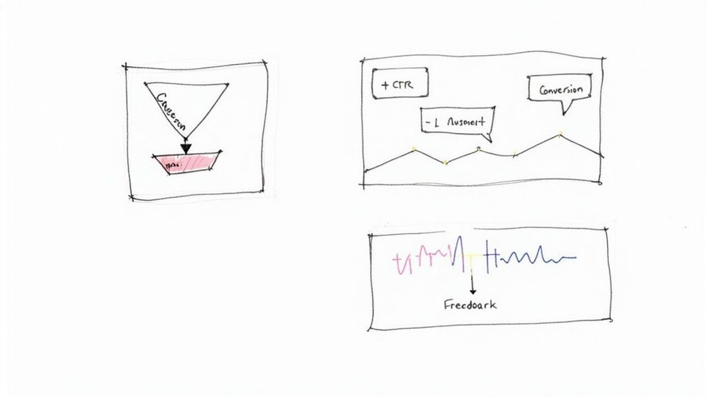
Where are people getting stuck? Heatmaps are brilliant for this. They can show you where users are clicking on things that aren’t actually links - a dead giveaway for confusion.
What path do most people take before converting? Your analytics can map out the most common user journeys, highlighting which pages are doing the heavy lifting.
Why are people leaving the pricing page? Session recordings are your secret weapon here. They let you watch anonymised user sessions to see their exact mouse movements and where they hesitate.
These questions give you actionable insights, not just abstract data points.
Setting Up Simple Feedback Loops
One of the quickest ways to know if your design is working is to ask. You don’t need a complicated user research setup; a few straightforward tools can give you incredible clarity.
Founder Moment: We worked with a founder who was tearing their hair out over a high bounce rate on their homepage. We helped them add a one-question survey: "What was the main thing you were hoping to find on this page today?" Within a week, a clear pattern emerged. Visitors were looking for pricing, but it was buried three clicks deep. Bringing the pricing link front and centre immediately improved engagement.
This slight shift replaced months of guesswork with a clear, data-driven next step. It’s a perfect example of how designing for the web is a continuous cycle of listening and responding.
This focus on user experience is why businesses across Australia are investing heavily in their websites. The local web design services market hit $1.4 billion in 2024, because companies now realise that a user-friendly site is non-negotiable. You can learn more about how Australian businesses are prioritising their digital presence on Elephant in the Boardroom.
This approach gives you the structure and confidence to iterate intelligently. You stop wondering what to do next and start building a clear, evidence-based path forward.
Your Calm, Confident Next Step
If everything we’ve covered about designing for the web still feels a bit tangled, that’s completely normal. You’re not behind. You need structure.
The classic mistake is trying to do everything at once - redesigning the layout, rewriting the copy, and fixing site speed, all in one go. That’s a recipe for burnout that lands you right back where you started.
Instead, take a breath and get focused on just one thing. Before you open a single design file or write a line of code, your job is to answer one surprisingly simple question.
Find Your Single Point of Focus
What is the most critical action you want a visitor to take on your website?
That’s it. Don’t overcomplicate it. Do you want them to book a demo? Start a free trial? Contact your sales team? Get absolutely clear on that one primary goal.
Practical Application: Write it on a sticky note and stick it to your monitor. This isn't just a mental exercise; it’s about creating a North Star for your entire project. Every decision from here on gets filtered through this one question: "Does this help someone book a demo?"
All effective web design starts from this single point of clarity. It’s the foundation that informs every other choice you’ll make, from the hero section on your homepage to the words on your main call-to-action button.
Most teams get bogged down in details because they’ve never defined their strategic anchor. Without it, everything seems equally important, and you end up going in circles.
Making this one slight shift changes everything. It instantly organises your thinking, cuts through the noise, and gives you the confidence to start making real progress. This is how you find your way out of the chaos. Start right here.
Common Web Design Questions
Even with a clear plan, it’s natural to have a few questions. Web design can often feel like a world of contradictions, where every answer opens up another can of worms. This is where good projects lose steam as uncertainty creeps in.
Let’s tackle a few common questions. The aim here isn’t to give you rigid rules, but a solid framework for thinking through these problems. It’s about giving you the confidence to move forward without getting lost in the details.
How often should I redesign my website?
Forget about massive, disruptive redesigns every few years. It’s far more powerful to embrace continuous improvement. A full-blown redesign is usually a panic response to a website that’s been left to gather dust. A smarter approach is to make small, steady changes based on real user feedback and performance data.
This way is less risky, more manageable, and ensures your site grows with your business. Of course, if the user experience is fundamentally broken or you’ve completely pivoted your business, a bigger project might be needed. But for most, consistent, small-scale iteration gets better results with less chaos.
What’s more important: UX or visual design?
This is a false choice. They don’t compete; they’re two sides of the same coin.
User Experience (UX) design is the invisible architecture - how the site works, the logic behind the layout, and how easy it is to get something done. Visual design (UI) is the part you see - the colours, fonts, and images that give that architecture personality.
A beautiful website that’s a nightmare to navigate is a failure. So is a functional site that looks unprofessional. You need both.
The trick is getting the order right. Always start with the UX. A solid, logical foundation makes the visual design process smoother. Get the flow right first, then make it look good.
Can I use a website template to save money?
For a brand-new business on a tight budget, a template can be a reasonable starting point. It gets you up and running fast. The danger is that you’ll spend all your time trying to cram your company’s unique message into a generic box that was never built for it.
This often results in a brand that blends in and a site that doesn’t get results, simply because the layout isn’t designed for the specific path your ideal customer needs to take. If you use a template, be ready to customise it heavily to support your business goals.
For any business serious about growth, a custom design built around your strategy will almost always deliver a stronger return. When our team embeds with a client, this is often the first hurdle we help them clear - moving from a generic template to a strategic, focused website.