
What Makes a Good Website? A Founder’s Guide to Clarity and Confidence
- Dec 26, 2025
- 15 min read
Ever stare at your website and feel... stuck?
It’s a familiar feeling. You know it’s not quite working, not connecting with the right people, not explaining what you do clearly, but you can’t put your finger on why. It’s just a nagging sense that something is off.
You’re not going crazy. The internet is full of conflicting advice. One expert tells you to add a chatbot, another preaches parallax scrolling, and a third insists on long-form content. All this noise leads to paralysis, not progress.
The Real Problem Is a Missing Blueprint
This feeling of chaos almost always comes down to one thing: a lack of structure. Most websites aren’t built; they’re accumulated. A new service gets tacked on here, a random blog post goes there, and a new feature is bolted on because it looked cool on a competitor's site.
Over time, your website becomes a messy collection of good intentions instead of a sharp, focused tool built to do a specific job. This is the exact gap we find when we start working with a team: they have all the right pieces, but have never had a blueprint for putting them together from the customer's point of view.
A practical example: You look at your homepage and have the sudden, awful realisation that a first-time visitor would have no idea what you actually sell. The main banner is pushing an old webinar, the navigation is a jumble of product features and company values, and the call-to-action is a vague "Learn More" button that leads to an even more confusing page.
This isn't a sign of failure. It's a sign that your business has outgrown its digital home. The good news is that the fix isn't some massive, eye-wateringly expensive overhaul. It’s about a simple shift in thinking, from adding more stuff to creating more clarity.
Our goal is to give you a calm, structured way to look at this, so you can stop guessing and start building something that actually works.
The Three Pillars of a Website That Delivers
Let's cut through the noise. Forget the flashy trends and marketing jargon. A genuinely good website isn't about chasing the latest fad; it's about building on a solid, timeless foundation. The kind of website that feels calm, confident, and actually gets results rests on three simple pillars.
This is often the first thing we untangle when we embed with a team. They'll have fantastic ideas but no real structure to hang them on, which results in a site that feels cluttered and confusing. This confusion is a huge source of the overwhelm that founders feel when they look at their own website.
This diagram shows how that sense of being overwhelmed is often rooted in simple, fixable problems, such as confusion and clutter.
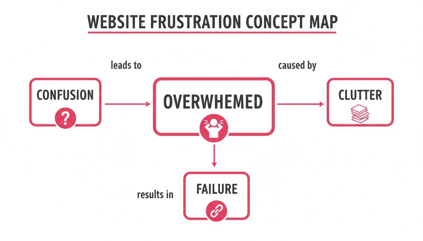
The key insight here is that the feeling of failure isn't the real problem; it’s a symptom of a disorganised and unclear digital experience. By focusing on these core pillars, we can replace that chaos with structure and clarity.
Pillar 1: Clear Positioning
Your website has about five seconds to answer three critical questions for any new visitor:
What do you actually do?
Who is this for?
Why should I care?
If the answers aren't immediately obvious, you've lost them. They'll hit the back button without a second thought.
Clear positioning isn't just a clever tagline. It’s ensuring your entire homepage, from the main headline and hero image to the first call-to-action, instantly communicates your value to your ideal customer. It’s the difference between a visitor thinking, "I have no idea what these people sell," and "Ah, this is exactly what I've been looking for."
Pillar 2: Effortless Navigation
Once a visitor understands what you do, their next step should feel completely intuitive. Effortless navigation isn’t about stuffing a hundred links into your menu; it’s about designing a logical journey that guides people to the information they need without making them think.
Think of your website as a well-signposted walking trail. The path is clear, the signs are easy to read, and you know exactly where you're heading. A confusing website, on the other hand, is like being dropped in a forest without a map; it's frustrating, and most people will give up.
A good website anticipates the user's next question and provides the answer before they even have to look for it. It creates a smooth, easy path from initial curiosity to genuine interest.
Pillar 3: Tangible Trust
Trust is the final, essential pillar. It’s not something you can claim with words like "we're the best." You have to build it, piece by piece, through tangible signals. These signals are created through professional design, consistent messaging, and concrete proof that you can deliver on your promises.
So, what actually builds this tangible trust?
Professional Design: A clean, modern, and error-free design immediately signals that you take your business and your customers seriously.
Social Proof: Things like testimonials, in-depth case studies, and client logos show that other people have already trusted you and had a good outcome.
Clear Contact Information: Making it dead simple for people to get in touch shows you're a real, accessible business, not a faceless entity.
When a website gets these three pillars right, the entire experience shifts. It goes from being a confusing digital brochure to a confident, effective tool for your business. This is where a sprint-based approach can create clarity fast, as it forces a team to address these foundational gaps before anything else. Get these right, and you’re already well on your way.
Why User Experience Is More Than Just Good Design
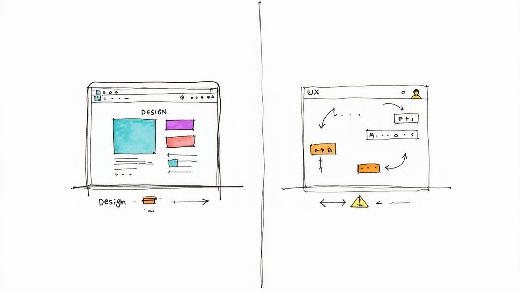
It’s easy to get this wrong. Many people use the terms ‘design’ and ‘user experience’ (UX) interchangeably, but they are worlds apart. Believing a beautiful website is automatically a good website is a trap, and this simple misunderstanding is often where a site’s performance completely falls apart.
Think of it this way:
Design is what your website looks like, the colours, fonts, and photography. It’s the visual appeal, the first impression.
User Experience (UX) is how your website feels to us,e the logic, the flow, and how easy it is for a real person to get something done.
A visually stunning site that’s secretly a nightmare to navigate is a failure. It’s like a beautiful car with the steering wheel in the back seat. Looks great, but it’s useless.
The Cost of Confusing Beauty with Function
We see this disconnect all the time. A founder will show us a site they’re incredibly proud of. It looks professional, polished, and slick. But the analytics tell a different story: visitors are leaving almost as soon as they arrive. And the founder can’t figure out why.
Here’s a practical example we encountered:
An agtech founder had a truly gorgeous website. The branding was sharp, the imagery was powerful, and it looked like a market leader. The problem? Their pricing page was buried three clicks deep behind a vague menu item labelled ‘Solutions’.
The visuals drew in potential customers, but they couldn't find the most basic information needed to make a decision. They’d poke around for a minute, get frustrated, and leave. The beautiful design was actually hiding the path to a sale.
This is a classic case of putting form before function. The visual elements were decided on long before anyone mapped out how a real customer would actually use the site.
Putting the User’s Journey First
To build a website that guides people rather than confuses them, you have to flip the process. You must focus on UX first. This means asking practical, straightforward questions before a single colour is chosen:
Who is actually visiting our site, and what is the one thing they need to find?
What is the most straightforward, most logical path for them to find it?
Once they find it, what question will they have next? How can we answer that for them right there?
Answering these questions creates a blueprint for the user’s journey. This is often our first step when we start a project, we map out the flow of information before we even think about aesthetics.
This shift is crucial. It ensures the visual design exists to support the user’s experience, not get in its way. Good design makes the right path clearer, not just prettier. The goal isn’t a beautiful website; it’s a website that feels effortless and obvious to the people you’re trying to reach.
Ultimately, that clarity is what builds trust and helps your business.
How to Keep Visitors Engaged on Your Site
Ever felt that sinking feeling when you see people landing on your website, only to leave in a flash? It’s incredibly frustrating. You put in all the effort to get them there, and then... they’re gone. This isn't just bad luck; it’s a sign that your website isn’t giving them a compelling reason to stick around.
A high bounce rate is really just a symptom of a much bigger issue. It means your site lacks the logical threads that should guide visitors from one piece of information to the next. Engagement isn't about fancy animations or annoying pop-ups. It’s about creating a clear, satisfying journey that keeps people clicking because they feel like they're getting somewhere.
This is a common blind spot for many teams. They’ll create pages in isolation, a blog post over here, a service page over there, but they forget to build the bridges between them. When we work with clients, one of the first things we map out is intentional pathways to build momentum for users.
Designing a Journey, Not Just Pages
An effective website doesn't just throw information at people; it tells a story, one step at a time. It might lead a visitor from a blog post that perfectly describes their problem to a case study that shows how you solved that exact issue for a similar business. The next logical step? Your service page, which details the solution.
Each click should feel like the obvious next move. This deliberate flow is what turns a static online brochure into a genuine business tool. It forces you to stop thinking about your site as a collection of individual pages and start seeing it as a series of interconnected routes designed to answer a user's questions as they arise.
The most successful websites in Australia have nailed this. If you look at giants like Google.com and YouTube.com, they manage an average of 5.84 and 9.36 pages per visit. This isn’t an accident. It proves that when your content is relevant and the navigation is intuitive, people will naturally explore further. This sends a powerful signal to search engines that your site offers real value. You can discover more insights on Australian website traffic growth on Statista.
Practical Steps to Boost Engagement
Creating these pathways isn't some abstract marketing concept. It boils down to a few simple, structural changes that can make a massive difference in how long people stay on your site.
Start by looking at your most popular entry points, like a blog post that gets a lot of traffic. From there, ask yourself a few key questions:
What’s their next logical question? After reading this article, what will they want or need to know next?
Where’s the proof? Can you link to a case study, a client testimonial, or a project that demonstrates your expertise in action?
What’s the following action? Is there a clear, low-effort next step? Maybe it’s downloading a related guide or simply viewing a relevant service page.
This methodical approach to internal linking turns dead ends into open doors.
A visitor should never land on a page that doesn’t give them a clear and relevant place to go next. Every page should anticipate their next move and make it easy for them.
Many professional services websites fail to win clients for this very reason, they don’t create these clear, confident journeys. But fixing it doesn't always require a complete redesign. It's about taking a good, hard look at your existing content and building the logical bridges that are missing. Just start with one key user journey, map it out, and ensure every step provides clarity and direction.
Making Your Website Work Seamlessly on Any Device
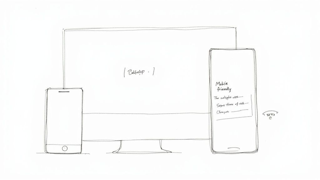
Chances are, you’re reading this on your phone right now. And if this page were a jumbled mess of tiny text and untappable buttons, you’d have already given up and left. It’s a simple, frustrating truth that so many websites still get completely wrong.
For years, the advice has been to "make it mobile-friendly," but too often, this is treated like just another box to tick. The real problem isn't that a site looks bad on a phone; it's that it becomes utterly useless. When your website doesn't work on mobile, you’re not just annoying people; you’re actively shutting the door on potential business.
This is especially critical in Australia, where mobile traffic makes up a massive slice of the digital pie. With nearly everyone owning a smartphone, a site that isn’t responsive is essentially invisible to a large portion of your audience. For many B2B tech and service businesses, over 50% of their traffic comes from mobile devices, making a flawless mobile experience non-negotiable.
It’s More Than Just Shrinking to Fit
Proper responsive design isn't about simply cramming your desktop site onto a smaller screen. It's about completely rethinking the experience for someone on the go, probably dealing with a patchy connection and with very little patience.
This means your website needs to be built for a completely different context. Someone on their phone needs information fast. They don’t have time to pinch and zoom just to read your content or wrestle with a form that was never designed for a thumb.
A founder moment: Picture this. A potential client is waiting for their coffee and decides to fill out your contact form on their phone. The fields are too small, the keyboard hides the 'submit' button, and after two frustrating attempts, they give up. You just lost a lead and you’ll never even know it happened.
This is where many teams stumble. They treat mobile responsiveness as a technical chore for a developer, not as a core part of their business strategy. When we embed with a team, one of the first things we do is map out how the user journey changes across different devices to prevent these exact kinds of silent failures.
What “Mobile-First” Actually Means for You
Here’s the kicker: Google now uses the mobile version of your website for its indexing and ranking. This is called mobile-first indexing. Put simply, if your site is a disaster on mobile, Google sees it as a disaster, period.
This isn't some arbitrary penalty; it's just Google reflecting reality. They want to give their users the best possible results, and a website that’s broken for half the population is never going to be one of them. A great website has to prioritise the mobile experience, not treat it as an afterthought.
So, what does this look like in practice? Ask yourself these questions:
Touch-Friendly Targets: Are your buttons and links significant enough to tap easily without zooming in?
Readable Text: Is the font size actually legible on a small screen?
Simplified Navigation: Is the menu easy to open and use, or is it a cluttered mess that takes over the whole page?
Fast Load Times: Does your site load quickly on a 4G connection, not just on your super-fast office Wi-Fi?
Getting this right isn’t just about keeping the search engines happy. It’s about showing your customers that you respect their time and attention. If you need more practical guidance, take a look at our founder's guide to designing for the web without the chaos. Building a structure that works everywhere is the foundation for a strong, confident online presence.
Why Your Website Is Never Truly Finished
There’s a dangerous myth that once your website is launched, the work is over. Founders often breathe a massive sigh of relief, tick that to-do list item, and move on. But that way of thinking is precisely why so many websites lose their edge and feel dated within a year or two.
Treating your website like a finished product is like assuming your business will never change. A great website isn't a static brochure; it’s a living, breathing part of your business that needs to grow right alongside your goals, your customers, and the market itself. The real work actually begins after you go live.
This is where many teams get stuck. They've never had a system for managing this ongoing evolution, so the idea of constantly changing the site feels chaotic, expensive, and frankly, a bit overwhelming.
From Big Bang Redesigns to Small, Smart Adjustments
The old way was to do a massive, costly redesign every few years. That approach is slow, risky, and often disconnected from what your customers actually need. A much better way to think about it is through continuous improvement, making minor, data-driven tweaks that build real momentum over time.
Instead of just guessing what needs fixing, you let your users’ behaviour guide you. For instance, you might dive into your analytics and notice a vast number of people are dropping off a specific service page. That's not a failure; it’s a valuable clue.
It could point to a few things:
The language is full of jargon and doesn't speak to your audience.
A key link or button is broken, leading to a frustrating dead end.
The page doesn't answer the next logical question a visitor has.
Fixing that one small gap can have a ripple effect, improving the entire customer journey. This is where a sprint-based approach comes in handy, letting you test, learn, and adapt quickly without getting bogged down in a never-ending project.
Stagnation Is a Liability
In a market like Australia, with its incredibly high internet use, a static website doesn't just stand still; it actively falls behind. A good website is often defined by its ability to grow traffic, and that growth comes from adapting to what users want. Some Australian e-commerce sites see massive annual traffic growth simply by constantly evolving, while some big, established players see their numbers decline because they fail to change. You can discover more insights on Australian website traffic growth on Statista if you want to dig into the data.
Your website is never truly "done." It is a constant work in progress. You’ll improve it, tweak it, experiment with it, and hopefully take pride in how it showcases your work as it evolves.
The goal isn't to launch some mythical "perfect" website on day one. It's to build a solid foundation and then commit to making it a little more straightforward, a little easier to use, and a little more effective every single month. This mindset replaces the immense pressure of perfection with the calm confidence of consistent, informed action. It ensures your website remains your hardest-working asset, not a digital relic.
Your Calm and Confident Next Step
If you've read this far and feel a bit overwhelmed, that's completely normal. You’re not behind; you’re just at that point where a clear plan makes all the difference. The biggest mistake we see businesses make is trying to fix everything at once.
So, what's the most critical thing to do right now? Get crystal clear on your positioning. Before you spend a dollar on design, write a single line of copy, or brief a developer, you need to nail this one thing.
Ask yourself this: can a first-time visitor land on your homepage and understand exactly what you do, and for who, in under five seconds?
If there's even a hint of a "no," that's your starting line. Sit down and write one simple, powerful sentence that explains the value you deliver. This sentence is your foundation. Getting it right gives you a filter for every other decision you’ll make. It’s the very first thing we tackle in a Sensoriium Foundations Audit because it provides the structure needed to move forward with absolute confidence.
Everything else, your content, your design, your technology, flows from this single point of clarity. Get this right first, and you’ll find the calm and momentum you need to build what comes next.
Frequently Asked Questions
It's completely normal to have a dozen questions swirling around when you're trying to nail down what makes a website actually work. Most founders feel this way; you're getting advice from every direction, and it’s hard to know what to focus on.
Here are some clear, straightforward answers to the questions we hear all the time.
How Often Should I Update My Website?
The best answer isn't a fixed timeline, but a mindset shift: think continuous improvement, not massive overhauls. Forget the old-school approach of a stressful, expensive redesign every few years.
A much better way is to work in smaller, calmer cycles. Check your analytics once a month. See a page with a huge drop-off rate? That’s your cue to dig in and see what's wrong. We find that running small, focused improvement sprints each quarter is what really builds momentum. You might update key content, test a new call to action, or smooth out a clunky user journey.
It’s about evolution, not revolution.
What Is More Important: SEO or Design?
This is a classic question, but it sets up a false choice. It’s like asking what’s more important for a car: the engine or the wheels? You need both, and they have to work together.
Great SEO gets people in the door. Great design and a thoughtful user experience convince them to stay, trust you, and ultimately, take action. You could have the most technically perfect, optimised site on the planet, but if it’s a confusing mess or looks untrustworthy, people will hit the back button in seconds. That bounce-back behaviour actually tells search engines your site isn't a good result, hurting your SEO in the long run.
So, start by mapping out a clear user journey (UX), wrap it in a clean, professional design, and then weave your SEO strategy through every part of that foundation.
How Much Does a Good Website Cost?
The cost can vary enormously, but it's more helpful to think of it as an 'investment' rather than a 'cost'. A well-structured but straightforward website might be a few thousand dollars, while a highly complex platform with custom features can efficiently run into the tens or even hundreds of thousands.
But here’s a better question: "What is the cost of a bad website?"
A cheap site that fails to generate leads, damages your brand's credibility, and becomes a time-suck for your team is infinitely more expensive than one that's appropriately planned and delivers a return. Focus on the value your website needs to create for your business first, and then you can figure out a budget that makes sense.
If you're tired of guessing and need a clear path forward, that's what Sensoriium does. We provide the structure and confidence your business needs to grow. Find out how we can help at https://www.sensoriium.com.