
What is a Logomark? A Clear Guide for Founders
- Jan 29
- 8 min read
Ever look at your logo and just feel… stuck?
Maybe it looks clunky on your website, gets lost as a tiny social media profile picture, or just doesn't reflect the sophisticated business you’re actually building.
If that sounds familiar, you’re not crazy. It makes sense that you feel this way.
That feeling of unease usually comes from a simple misunderstanding of the different parts of a brand identity, like the difference between a ‘logomark’ and a ‘logotype’. This is where the chaos often starts. Most teams struggle here because they've never had a clear framework for their brand assets.
This isn’t about aesthetics. It's about creating a practical toolkit for your business. When your branding elements are messy, it slows everyone down.
Your logo should work for you, not against you. If it feels awkward or inconsistent, it’s a sign that the underlying structure is missing, not that you have bad taste.
Getting your head around these basic terms is the first step toward building a brand that feels organised and professional. It's the kind of foundational knowledge we explore in our guide on what strategic branding is and why it feels so messy.
This article will give you that clarity. We'll cut through the jargon and show you what to do next, helping you move from confusion to confident action.
So, What Exactly Is a Logomark?
Let's cut through the design jargon.
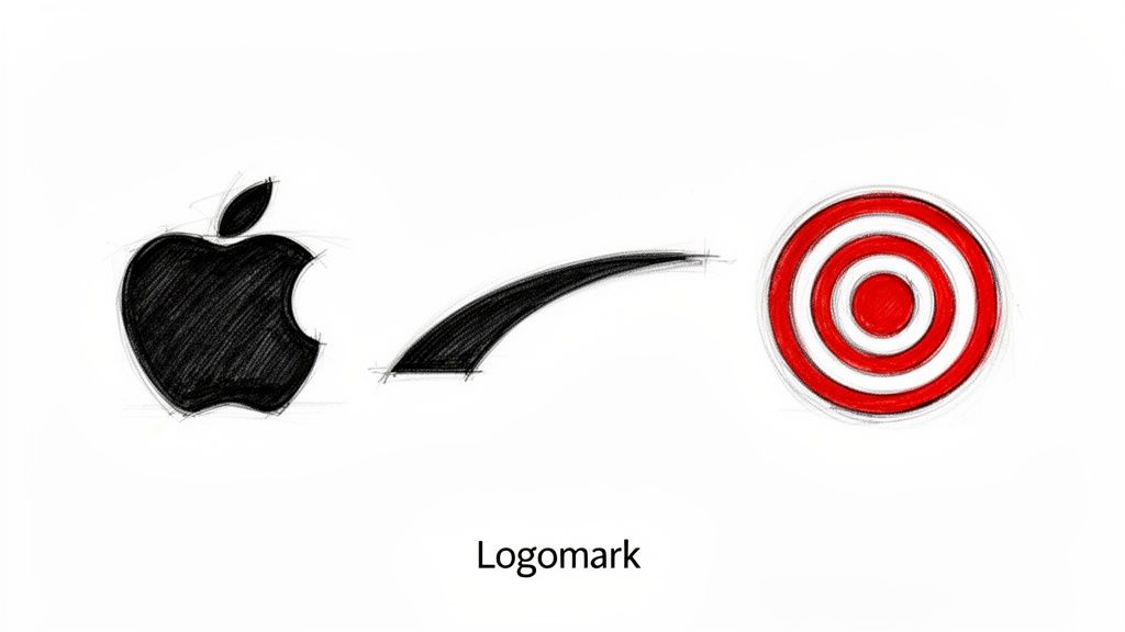
A logomark is purely an image—a symbol or an icon—that represents your business without using any words. It’s the visual shortcut for your brand.
You already know the famous ones: the Apple silhouette, the Nike swoosh, or the Target bullseye.
It’s an image designed to be instantly recognisable, even from a distance. For any growing business, this kind of immediate recognition is a massive advantage.
This is about more than a pretty picture. It's about creating a scalable, memorable asset that communicates who you are before you've said a single word.
More Than a Symbol—It’s a Practical Tool
A well-designed logomark is incredibly useful. It acts as a flexible, hard-working tool for your brand, fitting into all the tight spots where a full company name just can’t go.
Think about these everyday situations:
An app icon on a phone screen: Your full business name is never going to fit there, but a clean symbol will.
A social media profile picture: In that tiny circle, a simple logomark stays clear and easy to recognise.
A favicon in a browser tab: This is probably the smallest space your brand will ever occupy, and a logomark is the only thing that stands a chance.
This isn’t a new idea. Using a symbol to claim ownership has deep roots in the history of Australian trademarks, building on laws that protected symbols like the world's first trademark, Bass Brewery's red triangle.
For the tech and agtech businesses we work with, a strong logomark becomes a valuable piece of intellectual property. In fact, IP Australia data shows a registered trademark, like a logomark, can significantly reduce infringement risks.
A logomark’s real job is to build a mental connection. When someone sees the symbol, they should immediately think of your business. It’s a silent ambassador for your brand.
When we embed with a team, creating this kind of versatile asset is always a key step. It gives the brand structure and confidence, ensuring it shows up consistently and professionally, no matter where it appears.
Logomark vs Logotype: Getting the Lingo Right
This is where the wires often get crossed.
People throw these terms around as if they mean the same thing, but they’re different tools for different jobs. Getting this clear is the first step to building a visual identity that actually works.
So, what’s the difference?
A logomark is the picture. It’s the symbol, the icon, the visual shorthand. Think of Apple’s bitten apple or the Nike swoosh. No words needed.
A logotype, on the other hand, is the name itself, styled in a unique way. It’s often called a “wordmark.” Think of the distinctive script for Coca-Cola or the clean, simple letters of Google.
When we start working with a new company, this is one of the first things we clarify. It’s amazing how quickly it brings order to the chaos. Suddenly, you stop seeing your brand as one rigid logo and start seeing it as a flexible toolkit.
The real mindset shift comes when you stop thinking, "I need a logo," and start thinking, "I need a logo system." A single logo can box you in, but a system gives you the right tool for every situation.
The Two Halves of Your Brand's Identity
Here’s a practical way to think about it: the logomark is your brand’s nickname, while the logotype is its full name. One is for quick hellos where space is tight (like a social media profile pic), while the other provides the full introduction.
The best brands often combine them into what's called a combination mark, giving them the instant punch of a symbol and the clarity of a name.
To make this crystal clear, let's break down how they stack up against each other.
Logomark vs Logotype At a Glance
Here’s a simple comparison to help you see the role and best use case for each part of your logo system.
Attribute | Logomark (The Symbol) | Logotype (The Word) |
|---|---|---|
Primary Goal | Instant recognition and recall | Building name awareness |
Best For | App icons, social media profiles, favicons, merchandise | Website headers, business cards, official documents |
Key Strength | Scalability and flexibility in small spaces | Clarity and directness; leaves no room for confusion |
Main Challenge | Requires time and marketing to build association with your name | Can be too long or complex for small applications |
Ultimately, a strong brand knows when to use the symbol, when to use the word, and when to bring them together. It’s about having options and using them strategically.
When to Use a Logomark for Your Business
A logomark isn’t the right move for every business, especially when you’re just starting out. It's easy to wonder if you’re just chasing a design trend rather than making a practical call.
The truth is, a logomark should solve a problem for your brand.
Its real strength is its versatility. For a SaaS business, that little symbol becomes the perfect app icon or the favicon in a browser tab. For a service company, it’s a clean, memorable profile picture on social media. It gives you a way to show up professionally in all those tight spaces where your full business name just won’t fit.
A Practical Example
Here’s a founder moment I see all the time: an agtech startup wants to get its brand on uniforms and machinery. They quickly discover their full company name is a mess when embroidered on a cap and completely unreadable when stamped on a small piece of equipment. A simple, bold icon, however? Perfect. This is the point where a logomark shifts from a "nice-to-have" to a must-have business tool.
The main takeaway here is that each format has a different job—one is built for instant recall, the other for initial recognition.
Making this decision early gives your brand structure and ensures you're investing in assets that genuinely support your growth. You can learn more about why a small business needs a clear brand identity in our related guide.
Putting Your Logomark to Work
So, you’ve got a brand new logomark. Fantastic. But having a great symbol is only half the battle; knowing how to use it is where the real work begins.
This is often where things go off the rails, creating a messy, inconsistent look as your team grows and more people start using your brand assets.
A good logomark has to be a chameleon. Will it look just as sharp on a massive billboard as it does as a tiny app icon on a phone screen? If the answer is no, you have a problem. Scalability isn't just a nice-to-have; it's essential.
This is exactly why your designer needs to hand over the right file types from day one.
Your Essential File Toolkit
To use your logomark properly, you need a small toolkit of files. Each format has a specific job, and having the right one ready to go will save your team a world of pain. Honestly, getting this organised is one of the first things we do when working with a new client.
Here’s what you must have:
Vector Files (SVG, EPS, AI): These are your master files. They’re built with maths, not pixels, so you can scale them up to the size of a building without any loss of quality. Your designer must provide these. No excuses.
Raster Files (PNG, JPG): These are pixel-based images for everyday digital use. PNGs are particularly useful because they support transparent backgrounds, letting you place your logomark cleanly over photos or coloured backgrounds on your website.
A simple, one-page brand guideline is your best friend. It prevents your brand from fracturing by setting clear rules for how to use the logomark, including which colour versions to use on light and dark backgrounds.
Symbolic brand icons are incredibly valuable assets. Here in Australia, IP Australia protects hundreds of thousands of marks, and a well-protected logomark is a clear signal of a professional operation. You can learn more about Australian trade marks and brand protection.
To get the most out of your logomark, think about where it will live in the real world, like on impactful custom signage solutions. Getting these systems sorted early means your marketing can run smoothly, without all the constant second-guessing.
Your Next Step Is Clarity, Not a Complete Redesign
Feeling that sudden urge to scrap your entire brand and start from scratch? Take a breath. That’s just overwhelm talking.
Your next move probably isn’t a massive, expensive redesign. It's about getting clear.
Start by listing where your current logo actually shows up. Pinpoint the specific problem you’re trying to solve. Is it genuinely unreadable as a social media icon? Does it look dated on your new website? Identify the real pain point before you do anything else.
A great logomark is born from strategic clarity, not from chasing the latest design trends. It’s a tool built to solve a specific business problem.
Before you spend a single dollar or write a brief for a designer, do this one thing: write down what your business stands for in a single sentence. Getting this foundation right is crucial. For more on this, check out a founder's guide to clear branding and messaging.
If this all feels a bit messy and unstructured, that’s normal. You’re not behind. You just need a clear framework to guide your next decision.
Common Questions About Logomarks
Even after getting the hang of what a logomark is, it’s normal to have a few questions. You want to get this right before you put serious time and money on the table. Let's tackle the most common ones we hear.
Can I Just Use a Logomark Without My Company Name?
You can, but it’s a move best left to brands that are already household names. Think Apple's apple or Nike's swoosh.
For most growing businesses, you'll get far more mileage out of a combination mark (your logomark paired with your company name). This approach does the heavy lifting of building that crucial link between your symbol and your name. Down the track, once people know who you are, you can let the logomark fly solo in places like app icons.
What Is the Biggest Mistake Businesses Make with Logomarks?
The single biggest pitfall is over-complication. A truly great logomark is simple and memorable. It has to look just as sharp as a tiny favicon as it does on a huge trade show banner.
Too many founders fall in love with a beautiful, intricate design that just falls apart in the real world. A simple test? Shrink it right down. If it becomes a blurry mess, it’s not going to work. This is a non-negotiable step in our own design process, ensuring every brand asset we create is genuinely practical.
An overly detailed logomark is a liability, not an asset. It creates confusion at small sizes and becomes a technical headache for your team, undermining the clarity it was meant to create.
How Much Should I Expect to Pay for a Professional Logomark?
This is a real "how long is a piece of string?" question. Costs can range from a few hundred dollars on a freelance marketplace to tens of thousands with a high-end agency.
For a scaling tech or service business, budgeting a few thousand dollars for an experienced independent designer is a realistic starting point. This should get you a quality outcome that includes proper strategic thinking and all the file types you’ll ever need. Remember, you're not just paying for a picture; you're investing in the strategy that makes it a valuable, long-term asset.