
Why Your Marketing Feels Disconnected From Your Website
- Feb 2
- 14 min read
If you’re a founder, this might sound familiar. You’re spending money on marketing—ads, content, emails—but your website just seems to sit there, completely separate from it all. It feels more like a static brochure than an active part of your strategy.
If you’re frustrated by this, you’re not crazy. It makes sense that you feel stuck. The gap between your marketing efforts and what your website actually does is real, and it’s where most growth plans fall apart.
The Real Reason for the Disconnect
This problem isn’t about bad design or missing features. It’s simpler than that: your website hasn’t been given a clear job.
Most websites are built in a vacuum, treated as a one-off project. The conversation is about colours and pages, not about the specific task it needs to perform to help your business.
Imagine hiring someone for your team without a job description. They might look the part, but without a clear role, they can’t contribute. They just take up space. That’s how most websites function—as an expensive, underutilised team member.
Most teams struggle here because they’ve never had someone step in to structure the work. They see “build a website” as the goal, rather than “build a system that turns visitors into qualified leads.”
A website's true value isn't measured by how it looks, but by the clarity and momentum it creates for your business. It should be the hardest-working asset you own, not just a digital placeholder.
This small shift in thinking changes everything. When you stop seeing your website as a finished project and start treating it as your most valuable strategic asset, you can finally fix that disconnect. You give it a job, measure its performance, and weave it into every marketing activity. The goal is to move from frustration to confidence, where your website provides the very structure your marketing needs to succeed.
Giving Your Website a Job in Your Marketing Engine
Let's rethink what your website is actually for. If it feels like an expensive online business card, it’s probably because it hasn’t been given a proper job to do. Your website's real purpose is to be the central hub that gives structure and direction to every single marketing effort you make.
Think of it like a well-organised workshop. Every tool—your ads, social media posts, and email campaigns—has a specific place and a clear purpose. Without that workshop, your tools are just scattered everywhere, creating chaos. Your website is the workshop; it’s where everything comes together to build something valuable for your business.
The Single Source of Truth
A strategic website acts as the single source of truth for your messaging and your customer’s journey. When you run a LinkedIn ad campaign, where does it point? When you send out a newsletter, what's the key link inside? They should all lead back to a specific, intentional place on your website.
This approach gives every promotional activity a clear destination. Instead of running scattered tactics that fizzle out, you start building a cohesive system. This consistency is what builds trust with potential customers. They see a clear, confident path forward, which makes them feel secure in taking the next step with you.
This diagram shows what happens when a disconnected website creates a gap between your marketing activities and business goals.
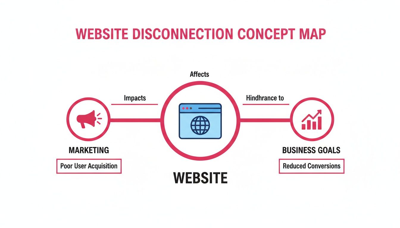
The image makes it obvious: when your website lacks a defined role, it fails to capture and convert the attention your marketing generates, which directly weakens business outcomes.
Turning Tactics Into a Cohesive System
Your website’s job is to make your entire marketing engine more efficient and effective. It’s the difference between shouting into the void and having a focused conversation with a potential customer. This is usually where a sprint approach creates clarity quickly.
Consider this practical example for an agtech company:
The Tactic: Running a targeted ad campaign on social media promoting new soil sensor technology.
The Disconnected Website: The ad clicks through to the generic homepage, forcing farmers to hunt around for information. Most will give up in frustration.
The Strategic Website: The ad clicks through to a dedicated landing page. This page speaks directly to the farmers' pain points, showcases the sensor's benefits with clear data, and has one simple call-to-action: "Download the Case Study."
In the second scenario, the website has a clear job: convert interest from the ad into a qualified lead. It has a specific task and a measurable outcome. This isn't just better web design; it's a fundamental shift in how you connect your actions to your results.
By giving each part of your website a specific function, you eliminate confusion for both your customers and your internal team. It provides the structure everyone needs to move forward with confidence.
When your website has a job, your marketing stops feeling like a series of disconnected gambles. Each campaign, email, and social post builds on the last, creating real momentum. Your website becomes the reliable engine that consistently turns attention into tangible business opportunities, giving you the clarity and control you’ve been missing.
How Strategic Design Creates Tangible Business Results
So, you’ve given your website a job. That’s a massive step forward. But it’s easy to feel stuck on the next part: how does a ‘good user path’ actually put more money in the bank?
If you're struggling to connect the dots between design choices and real business results, you’re not alone. It’s the gap where most marketing efforts fall apart. The truth is, strategic web design isn’t about making things look pretty; it’s about intentionally guiding people to an outcome that benefits both them and your business.
It's about making deliberate choices that directly influence behaviour.
This isn’t some abstract theory. Every single element on your page—a headline, a button, a testimonial—is a tool you can use to solve a business problem. When you really get the connection between these tools and your goals, you move from guesswork to structured, measurable action.
A Founder Moment: Putting Theory Into Practice
Let's walk through a simple scenario that brings this to life.
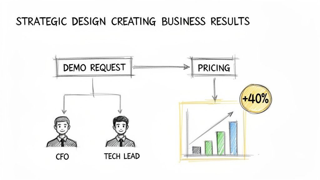
Imagine a SaaS company selling complex data analytics software. Their sales team is drowning in demo requests, but a whopping 80% of them are from businesses that are too small or just don't have the right technical setup. The team is burning countless hours on calls that go nowhere, and morale is tanking.
The business problem is crystal clear: too many unqualified leads are getting through. The marketing goal, then, is to filter these leads before they ever book a demo.
Here’s how strategic web design in marketing solves this:
Segmenting the Audience Upfront: The old product page tried to speak to everyone and, as a result, connected with no one. The redesign introduces a clear choice right at the top: "Are you a Technical Manager or a Business Leader?"
Creating Tailored User Paths: Clicking "Technical Manager" sends them to a page loaded with integration specs, API documentation, and a case study on workflow efficiency. The call-to-action is "View Technical Docs." This gives them the specific details they crave.
Focusing on Business Outcomes: On the other hand, clicking "Business Leader" takes them to a page focused on ROI, team productivity, and a calculator showing potential cost savings. Here, the call-to-action is "See Pricing & Plans." It speaks their language.
The result? The company saw a 40% increase in qualified demo requests within a single quarter. Why? Because the unqualified leads—the ones who just wanted to dig into the technical specs—were now able to self-serve. The demo button was reserved for people who had already seen the pricing and understood the business value, making them much more serious prospects.
This wasn't a "redesign" in the traditional sense; it was a surgical change driven by a business need. When we embed with a team, the first thing we fix is this exact gap. They get stuck focusing on making the page look better, not work harder.
Connecting Design Choices To Business Metrics
To make this practical for your own business, you need to start linking specific design elements to measurable goals. Truly effective User Experience Optimisation is all about driving commercial growth by focusing on conversions, leads, and sales. It’s about building a system, not just a collection of pretty pages.
To show you how this works in practice, let's look at how specific web design choices influence key business metrics.
Web Design Element | Marketing Goal | Business Outcome |
|---|---|---|
Clear headline addressing a specific pain point | Increase engagement from the right audience | Lower bounce rate and more time on page |
Prominent and specific call-to-action (CTA) | Drive a single, desired action | Higher conversion rate for demo requests |
Social proof (testimonials, client logos) | Build trust and credibility with prospects | Shorter sales cycles as trust is pre-built |
Simplified navigation menu | Reduce friction and guide users to key pages | Increased page views on high-value pages |
This table provides a simple framework, but it illustrates a fundamental shift in thinking.
This shift from "What should the website look like?" to "What should the website do?" is the foundation of effective web design in marketing. It gives you a framework for making confident decisions that create real momentum.
Ultimately, every choice on your website should be an answer to a business question. When you start thinking this way, your website stops being a cost centre and becomes the most powerful asset in your marketing toolkit. For more on this, you can read our founder's guide on what makes a good website to build more clarity and confidence.
Why Traditional Website Projects Create Chaos, Not Clarity
If you’ve ever been part of a big website redesign, you know the drill. It all kicks off with a burst of excitement, but that feeling quickly fades. Soon, you're drowning in a sea of endless meetings, watching the budget balloon, and trying to navigate a minefield of competing opinions from every corner of the business.
By the time the site finally launches—usually months late—everyone is just glad it’s over. But that relief doesn't last long. The shiny new website already feels out of sync with what your marketing and sales teams actually need right now.
If this sounds familiar, you're not going crazy. This is the natural outcome when a website is treated as a one-off, monolithic project. It’s built in a vacuum, completely disconnected from the messy, day-to-day reality of actually growing a business. This whole approach is fundamentally flawed because it’s based on the idea that you can perfectly predict the future, lock in your needs, and build something static that will magically work for years.
Businesses just don't work that way. Your strategy changes, your messaging gets refined, and your customers' needs are always evolving.
The Outdated-On-Arrival Problem
The biggest issue with the traditional 'big bang' redesign is that it delivers a solution for a problem that was relevant six months ago. The long, drawn-out process—from discovery and design to build and launch—means that by the time your site goes live, your business has already moved on.
Your marketing team has new campaigns to run, your sales team has fresh insights from the field, and that expensive new website doesn't support any of it. This chaos is a direct result of a lack of structure and a complete failure to weave the website into the daily rhythm of the business. It becomes a digital monument, not a living, breathing tool.
From Monolith to Momentum
The answer isn't to build an even bigger, more complex monolith. It's to throw out the old playbook entirely. Instead of tackling one overwhelming project, think in terms of small, focused, iterative sprints. This is where a sprint-based process brings clarity and allows your website to adapt and evolve right alongside your business goals.
Instead of trying to boil the ocean, you focus on the most pressing business problem first. Is your pricing page confusing prospects and killing deals? Let’s fix that in a two-week sprint. Is your demo request form attracting all the wrong kinds of leads? Let’s design a smarter qualification path.
This is a much calmer, more controlled way to get things done. It replaces chaos with structure and anxiety with genuine momentum. When we embed with a team, the very first thing we do is break down that enormous 'fix the website' task into manageable, high-impact sprints. For a deeper look at this, check out our founder’s guide to designing for the web without the chaos.
The High Cost of Sticking to the Old Way
For many B2B teams, the perceived cost and complexity of a traditional build are huge barriers. Here in Australia, a staggering 75% of users judge a company's credibility by its website design alone, yet many businesses put it off because of cost concerns (34%) and not having enough time (16%). This hesitation makes perfect sense when the only option on the table seems to be a chaotic, large-scale project that either never gets off the ground or fails to deliver real value. You can learn more about web design statistics in Australia to get the full picture.
The real risk isn't investing in your website; it's clinging to a broken process that guarantees frustration and delivers an outdated asset. An agile, embedded approach ensures your site remains a powerful, relevant marketing tool that actively supports growth.
Shifting to an iterative model turns your website from a source of chaos into a source of clarity. It becomes a responsive, strategic asset you can confidently rely on to meet the ever-changing needs of your business, giving you the structure and momentum you need to move forward.
Bridging The Gap Between Strategy And Execution
We’ve all seen it happen. A brilliant marketing strategy looks bulletproof in a slide deck. Then, it’s handed over to a designer or developer who wasn't in the room for those critical strategic conversations.
Suddenly, everything gets lost in translation. The nuanced plan to guide prospects through a specific journey becomes just another set of generic web pages that don’t actually do anything.
This is an incredibly common point of failure. It’s that gap where good intentions and clear thinking fall apart, leaving you with a website that technically exists but doesn't pull its weight in your marketing system. The problem isn’t a lack of talent; it’s a breakdown in communication between the ‘what’ and the ‘how’.
This is the exact problem we solve first when we embed with a team. Most of the time, the chaos stems from not having a clear, shared document that connects the strategic thinking to the practical doing.
From Briefing to a Clarity Document
A traditional design brief just doesn’t cut it anymore. A simple list of pages and features won't give a designer the context they need to make smart, strategic decisions on your behalf.
What you need instead is a Clarity Document. Think of it not as a technical specification, but as a simple, human-readable guide that gets everyone on the same page about the website’s specific job.
This document forces you to answer the tough questions before a single pixel gets pushed. It ensures every page is built with a clear purpose that directly supports your business goals. It’s the essential link that makes sure the final product actually reflects the initial strategy.
This handoff from strategy to execution is absolutely critical. For Australian tech and agtech companies, for instance, mobile optimisation is non-negotiable, with 63% of e-commerce purchases happening on mobile devices. What's more, a shocking 88% of online consumers won't return to a site after a bad user experience. If the strategic need for a seamless mobile experience isn't executed flawlessly, the entire marketing investment is wasted. You can find more insights like this from these web design statistics from RGC Digital Marketing.
What Your Clarity Document Must Include
Putting this document together isn’t complicated, but it does demand disciplined thinking. It provides the framework needed for a smooth, focused execution phase, preventing costly detours down the track.
Here’s what you should map out for every key page on your website:
Page Name: (e.g., Homepage, Services Page, Case Study Template)
The Job of This Page: What is the single most important thing this page needs to achieve? (e.g., "Get the visitor to understand our core value and click through to our services.")
The Visitor's Mindset: What are they likely thinking or feeling when they land here? (e.g., "They're feeling overwhelmed by their data and are looking for a simpler solution.")
The Single Most Important Action: What is the one primary action you want them to take? Not five things, just one. (e.g., "Click the 'Book a Demo' button.")
Key Messages to Convey: What are the 2-3 essential points they must understand before they leave this page?
By defining the job of each page so explicitly, you remove ambiguity. You empower your design and development team to make choices that are perfectly aligned with your marketing strategy, giving them the clarity they need to execute with confidence.
This simple document transforms the entire process. It shifts the conversation from subjective opinions ("I don't like that blue") to objective questions ("Does this design choice help the page do its job?"). It's the tool that finally closes the gap between a great idea and a website that actually delivers results, giving you the structure to connect your web design in marketing efforts for good.
Your First Step Is Not A Full Redesign
The thought of overhauling your entire website can be completely paralysing. Most founders I speak with feel a sense of dread at the very idea—the cost, the time, the sheer disruption. If that’s you, it’s completely normal.
The good news? A massive, top-to-bottom redesign is almost never the right first step.
Your immediate goal isn’t to ‘fix the website’ all at once. It’s to make it start doing its job. A single, effective job. Everything else is just noise for now. We’re not trying to boil the ocean; we’re just trying to get one thing right. This clarity is what turns chaos into momentum.
Focus On One Critical Path
Before you touch a single line of code or a single design element, your first job is to clarify the primary journey for your ideal customer. Strip everything else away and focus only on the path from your homepage to them making an enquiry or taking that next logical step.
Is that path clear, confident, and completely free of friction? Or is it cluttered with confusing options, vague language, and dead ends?
Here’s a practical way to think about it:
Who is it for? Be brutally honest about the single most valuable type of customer you want to attract right now.
What do they need to believe? What is the one core message they absolutely must understand to feel confident taking the next step?
What's in their way? Identify every single button, link, and piece of jargon that could possibly distract them or make them hesitate.
This isn’t about aesthetics; it’s about pure function. You are building one clean, well-lit path through a dark forest. It’s a simple, structured approach that delivers clarity, and fast. Ongoing maintenance, like what's covered in web care plans and why they're essential, can then help keep this path clear over time.
If this entire process feels messy and complicated, that’s a sign you’re on the right track. You’re not behind; you’re just untangling a problem that was never given the right structure in the first place.
Start by mapping out that single customer journey on paper. What are the essential steps? What can be removed? Fixing this one thing will have a bigger impact on your marketing results than any full-scale redesign ever could. It gives you a calm, manageable next step and a genuine sense of forward momentum.
Your Web Design & Marketing Questions Answered
It’s completely normal to have questions. The line between web design and marketing can feel a bit fuzzy, leaving founders wondering where to put their time and money. Here are some straightforward answers to the questions we hear most often from B2B tech teams.
How Often Should I Redesign My Website?
This is probably the most common question we get, but it’s often coming from the wrong angle. Thinking you need a massive, ground-up redesign every few years is what leads to chaos and wasted budgets.
A much better way to think about it is this: your website is a living asset, something that should be constantly evolving.
Instead of a big, disruptive overhaul, focus on smaller, iterative sprints that solve specific business problems. This agile approach means your site never gets stale and is always aligned with your marketing goals. It's a fundamental shift from one-off projects to continuous, structured improvement.
What’s The Most Important Part Of Web Design For Marketing?
Clarity. Simple as that.
It’s not about flashy animations or jumping on the latest design trend. The single most crucial element is how quickly and clearly your website answers three questions for a first-time visitor:
Where am I?
What can I do here?
Why should I care?
If a potential customer can't figure these out in seconds, all the money you spent getting them there is wasted. A design that offers a clear, confident path for your ideal buyer will always beat a design that’s just pretty. Structure and clarity are the bedrock of a website that actually generates leads.
Can A Good Website Replace My Other Marketing Efforts?
No, and it’s not supposed to. A great website doesn't replace your marketing; it gives all your marketing efforts a home and a purpose. It’s the central hub that makes everything else you do—your ads, your content, your outreach—work that much harder.
Think of your website as the engine, not the entire car. Your promotional activities get people interested, and it's your website's job to turn that interest into a real business opportunity. Most teams get stuck here because they've never had someone come in and structure the work so that all the pieces connect and work together.
If your website feels disconnected from your business goals, that's a sign you need structure, not just a facelift. Sensoriium provides the clarity and direction to turn your website into your hardest-working marketing asset. Find out how we can help you build momentum.